Some friends noticed I’m in the closed beta for The Chronicles of Spellborn and have been asking me what I think about it. I’ve confirmed that there’s no NDA so I can talk about it, but I’m a bit hesitant to do so since I’ve only taken one character to level 5 so far. But the work week rears its ugly head very soon and if I don’t write about it now I probably won’t get another chance to do so until next weekend.
So here are my initial, ‘gut level’ thoughts. I’ve probably gotten a lot of this wrong, so everything should be taken with a giant salt crystal. Further, I’m not going to defend this post; I feel kind of unsavory talking about a game I’ve only played for a few hours.
Anyway…
TCOS is different. If you’re sick of ‘classic’ MMO playstyles as found in EQ 1 & 2, DAOC, Warhammer, WOW & LOTRO, then you’ll be pleased to find some new ideas here. First of all, you have two levels. Your “Fame” level pretty much translates to level in most other MMOs. It mostly advances via Questing, with monster slaying only adding a little to it. Your PeP Level (Personal Experience P-P-P…??) level advances via combat. This level caps at 5 (!) but you lose a level every time you die. So the idea I guess is that your PeP well constantly be wavering up and down as you play. Each level of PeP gives you a new bonus/buff.
I like how this system gives us a death penalty with a real ‘sting’ but without the soul-crushing despair of losing a “classic” level or experience points.
Let’s look at graphics. The world is pretty astounding (imo). Here’re some thumbnails to full sized (1680×1050) wallpapers at photobucket:


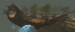
You might notice there’s no real sky. The lore of the game explains how the world was destroyed by humans and the Daevi (the two playable races in the game) as they threw off the yoke of slavery to the demons. Now what’s left of the world is broken up into shards floating in an infinite spell-sea of some kind, and shardships are used to sale between them. Here’s a shardship:

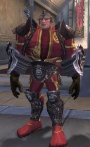
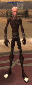
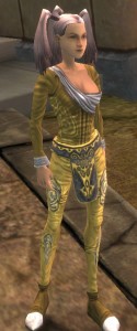
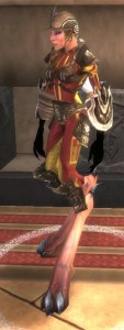
Now we get to the character models, and those are going to be really hit or miss for most players, I think. They’ve got a very unique style, I’ll give them that, but in many ways that style could be called “weird”. Here’s a selection of NPCs:


Let’s talk gear. When you create a character, you pick his/her clothing, armor and weapons. All of which is purely cosmetic. This was a huge shock to me, frankly. I love the ‘loot treadmill’ and getting a lucky drop of some cool new gear and at first, at least, it seemed like there was no such thing. But (and honestly I’m still hazy about the system) most of your gear has Sigil Slots, and you do get Sigils that drop as loot (I think…I’ve never got one) which you can place in your gear to make you more powerful. You can “upgrade” your gear, maybe just for looks, but maybe for more Sigil Slots? I’l still really fuzzy about this stuff.
Right behind gear comes combat, and here I am very, very conflicted. The character skills in combat are really interesting, while the player skills in combat are very annoying (to me). Let me elaborate.
As a character gains Fame Levels he can learn news skills, in typical MMO fashion. But instead of a series of hotbars, here we have a skill deck. Imagine the skill deck as a polygonal drum that rotates as you fight. Each “face” of the drum has 3-6 slots for skills (at character creation, each face has 3 but that number increases as you gain levels). When you use a skill, the drum rotates to the next face with a fresh selection of skills. At character creation the drum has only 2 faces, at level 5 that increases to 3, and I think by max level it’ll have 6 or 8 faces.
So the idea is to arrange the skill deck so that each row (which translates to a drum face in my analogy) has a skill that logically follows up a skill in the row prior to it. At least, I think that’s the smart way to play. Let me give an example. My character has a Shoot skill (fires an arrow) that I use to pull. I put that on Row 1 of my skill deck. My character also has a Shout that provides a short term buff. I put that on Row 2. So I open a fight by using Shoot. The aggro’d foe charges me, but by using Shoot my skill drum rotates to Row 2, where my Shout is. I use that as the creature charges, so my buff is ready for the fight ahead.
That’s just 1 column of my deck. My other columns are devoted to fast single target attacks, or slower multi-target attacks. This is all a pretty unique combat system that is (obviously) hard for me to describe, but it really gets you thinking about tactics. You can rearrange your skill deck anytime you want (well, except during a combat) at no cost so you can tweak them for a tough fight, or change it based on who you’re grouped with, etc.
To actually use a skill, though, feels a little combersome to me. You select a column using either the mouse wheel or the number keys, but that doesn’t fire the skill. In order to actually activate the spell, you have to hit the left mouse button, or hit the number key a second time, at which point the skill fires, the cooldown for it begins, and the “drum” rotates to the next row.
At the same time this is going on, you need to position yourself for the attacks. Spellborn uses a reticle system. You have to point your reticle at what you want to hit. And conversely, by moving you’ll make it harder for the enemy to hit you. Dodging isn’t a character skill, it’s a player skill. If you stand in one place and fight, combat is going to be very difficult for you. Instead, the idea is to hit the enemy then slide left or right to stay out of its cone of fire, so to speak. You’ve probably done this in PvP in MMOs before this one, but now you have to do this against mobs as well. Fighting a bear? Keep hitting it in its butt, circle-strafing it so it can’t face you to hit back.
Depending on your tastes, you’ll either find this incredibly fun, or incredibly annoying. Me, I find it fun for about half an hour then I get sick of circle-straffing around like a maniac during every fight. In my ideal MMO, my “skills” come in the form of tactics…mental skills. The actual combat should be about my character’s skills matching up against his opponent’s. I don’t play genres like FPSers much because I’m not very good at them and they bother my wrist.
The shame of it is that I find I don’t even use that slick Skill Deck system because I’m so focused on circling the enemy while keeping it targeted. I just hold down the mouse button and level the deck on my ‘fast skills’ column and basically let it auto-attack for me. Watching the skilldeck to see what “column” I have selected, and what skill is in that row and column, and whether that skill is ready or cooling down, is just too much for me while I’m also watching my enemy in 3D space and constantly moving so it can’t hit back. I seem to do better spamming 1 skill and moving than using tactics and paying attention to the skill deck to put it to good use.
And this is why I probably won’t be playing Spellborn after the beta. I love the Skill Deck, but I’m just not dextrous enough to put it to good use while doing this strafe-dance. It’s fun for a while but it’s not something I’d play a lot, so probably wouldn’t be worth a subscription fee. But that’s just me and this is a very personal choice, and even if it isn’t for me, I have to really commend the developers for coming up with something unique; there’s nothing out there like The Chronicles of Spellborn (at least, that I’ve seen) and I really hope it finds a huge audience.
To recap this wall ‘o text: The lore is very compelling. The environments are unique and interesting; I spent a lot of time just running around the first town looking at things. The quests and NPC dialog are well written and interesting. The gear/sigil system means everyone can look the way they want to look rather than wearing ugly gear because it has good stats. The skill deck system makes my inner strategist drool with hunger. Inventory slots are plentiful and buying and selling uses a very clean interface. The game runs really nicely. But for me, the frantic, twitchy combat just makes it a no-sale. 🙁

 Here we have a sample skill from my skill book. The cursor is hovering over the skill name (Swift Kick) resulting in the pop-up. We see it’s a short range “Maneuver” skill that deals “calculated” damage.
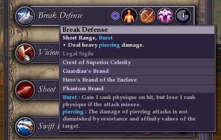 Here’s another skill, Break Defense. This one is a Burst skill. Burst works the same as Maneuver, except here it’s Physique that goes up and down, rather than Concentration. Physique increases movement speed. Having a nice high Physique is great for speeding away from battles going poorly!
 This series of shots just shows what the icons on the right of the skill listing indicate. The first indicates that Break Defense uses the Body attribute. As player gain levels, they get points they can put into 3 attributes: Body, Focus and … um, Will maybe? Persumably, this skill being tagged Body means it gets stronger as you put points into the Body attribute.
 The second icon indicates that this is a melee skill.
 The third icon indicates the magic type for this skill. Honestly, I don’t understand this one at all. I don’t *think* my character has a magic rating? This one has me really puzzled.
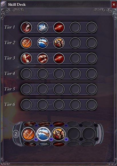 This, by the way, is what the skill deck setup window looks like. Corrections to yesterday’s post, clearly you have have 5 skills per row (or Tier as they’re more properly called) and eventually 6 Tiers in total.


